DOL.gov Forms
Modernizing a high-risk public service by redesigning the end-to-end service ecosystem across digital platforms, content operations, and governance systems
Overview
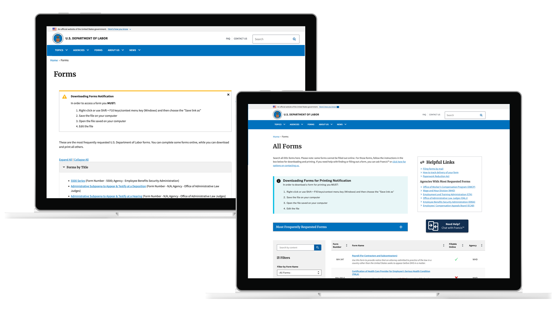
The DOL Forms experience was the most heavily trafficked entry point on DOL.gov, and one of the most fragile.
Users encountered an exhaustive, unsearchable list of forms with long, opaque titles, organized by internal assumptions rather than public needs. Critical information was buried in static accordions, multilingual access was effectively hidden, and mobile and assistive technology users were routinely blocked from completing basic tasks.
Rather than addressing symptoms through incremental fixes, this work defined a future-state direction for how high-volume, high-risk form systems could operate more clearly, accessibly, and sustainably.
I approached the effort as a strategy and de-risking initiative, using research, content modeling, and high-fidelity prototypes to clarify what modernization should mean before committing to build.
My Role
My responsibilities included:
Defining a future-state product vision grounded in real user needs and operational constraints
Designing and prototyping decision-ready experiences to support leadership alignment
Developing a scalable metadata and taxonomy framework to support discovery, accessibility, and growth
Exploring AI-assisted discovery patterns as support mechanisms, not replacements for clarity
Ensuring accessibility, governance, and sustainability were treated as core design inputs
I served as UX Strategy Lead and product designer for the Forms modernization initiative.
Service Scope
Public users seeking forms and benefits information
Internal content and operations teams managing form delivery
Digital platform (DOL.gov forms system and search experience)
Operational workflows including content governance and call center dependencies
Policy and compliance constraints including accessibility, multilingual access, and federal requirements
The goal was not production delivery.
It was to create a clear, defensible direction that leadership could evaluate, trust, and use to guide phased modernization.
Context
The Forms page functioned as a critical public utility. It supported access to unemployment assistance, wage recovery, benefits administration, and worker protections.
At the same time, it reflected years of accumulated content with no unifying structure. Forms were grouped by agency logic, not public intent. Search was absent. Guidance was minimal. Users frequently relied on the National Call Center simply to find the correct form.
This required a strategy that could reduce friction without introducing risk, and clarify direction without disrupting mission-critical access.
Modernization had to balance scale, accessibility, and continuity of service, while acknowledging the reality of legacy systems and long-term governance requirements.
Service Strategy
The strategy prioritized clarity and alignment before velocity.
Rather than starting with interface changes, I focused on understanding how people actually sought forms, where they failed, and what signals could guide them more effectively.
Key strategic moves included:
Reframing search and navigation around user intent, not organizational structure
Designing a metadata-driven content model to support relevance, accessibility, and multilingual parity
Exploring AI-assisted discovery as a way to reduce cognitive load and support wayfinding
Using high-fidelity prototypes to surface trade-offs, feasibility, and risk early
The prototypes functioned as decision tools, not visual deliverables.
They allowed teams to discuss concrete options rather than abstract plans.

modernization Snapshot
This work produced decision artifacts, not finished products.
The goal was to give leadership clear visibility into modernization paths, and provide WebOps with a credible foundation for phased execution.
Top third of the existing, static Forms page, serving more as an archive; and the reimagined modernized prototype incorporating Agentic AI and AI-driven in-page faceted search capabilities.
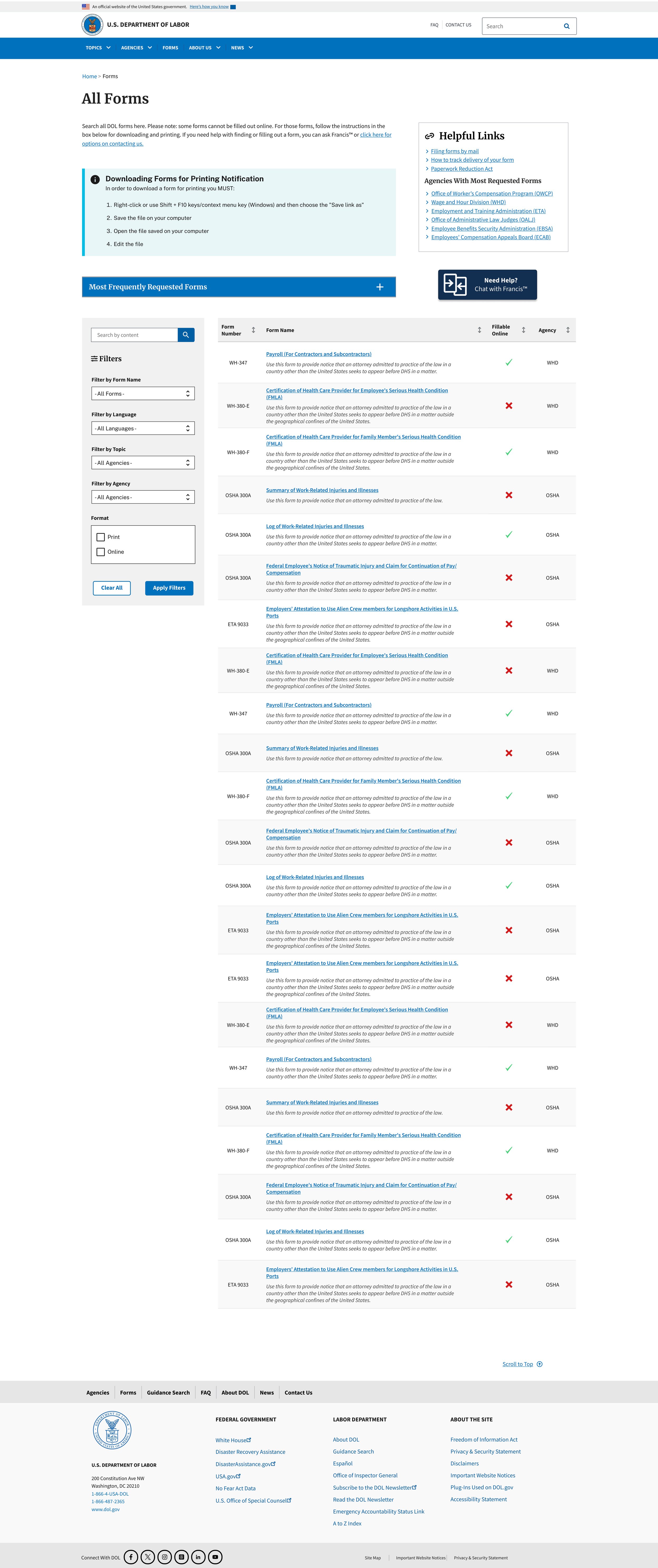
What these artifacts represent
A clear contrast between legacy behavior and proposed direction
High-fidelity prototypes used to evaluate risk and feasibility early
Design decisions grounded in accessibility, scale, and long-term maintainability
These artifacts were used to align stakeholders, clarify scope, and reduce uncertainty before engineering investment.
Key decisions reinforced
Treating forms as a product experience, not a document repository
Prioritizing discovery, wayfinding, and task clarity over surface-level redesign
Designing interaction patterns that could support future automation
Making governance and accessibility first-order design inputs
Outcomes
Defined a modernized product direction for one of DOL’s highest-risk public services
Produced decision-ready prototypes used in roadmap and planning discussions
Established reusable patterns for search, filtering, and content organization
Introduced AI-assisted discovery concepts focused on clarity and access
Improved alignment across product, content, accessibility, and governance stakeholders
Although the work concluded at the prototype stage, its value lay in reducing uncertainty and enabling informed investment decisions.
What This Approach Demonstrates
This case reflects how I approach early-stage modernization and new technology adoption in complex environments.
The work demonstrates how service design and product strategy can operate as a risk-reduction and alignment function, especially when systems are large, expectations are high, and the cost of misdirection is significant.
By grounding strategy in research, clear decision frameworks, and tangible prototypes, teams can modernize responsibly, without relying on short-term fixes or speculative builds.
While delivered in a public-sector environment, the challenges addressed here are common to enterprise and regulated organizations: legacy systems, fragmented content, accessibility requirements, and the need to modernize without disrupting critical services.